Built-in Block Reference
AstroTable converts GitHub Flavored Markdown (GFM) tables into matching Astro components ("Blocks") at build time. The first cell of the first row (the header row) is the Block name, and everything from the second row on is the content. Column meaning is positional: which column means what is decided entirely by each Block's implementation.
This page walks through every Block that ships with the core. You can also see them rendered live on the /en/block-library page, or expand "Show preview" under each section below.
/<locale>/block-library/embed/<name> is a lightweight, dedicated page that returns only that Block's rendered output, with none of the shared layout (header, footer, breadcrumbs, and so on). The previews on this page embed that route via an iframe. Because this is a static site, that page is a genuinely separate, build-time-generated HTML file — the header/footer aren't hidden at runtime with a query parameter or JavaScript, they're simply never included in the HTML. It lives under /<locale>/ like every other page, so the preview naturally matches whichever language you're reading (each Block falls back to its default example.md unless an example.<locale>.md override exists). You can reuse this route to embed a Block preview elsewhere, or in an external tool.
hero
A hero section with a large headline, background image, and CTA button. A 2-column key-value table (column 1 = key, column 2 = value). Supported keys: title (text), image (image), cta (link).
| hero | |
| --- | --- |
| title | Welcome to AstroTable |
| image |  |
| cta | [Shop now](/en/docs/blocks) |
The image value is applied as a background image. cta uses Markdown link syntax ([label](url)).
Show preview
cards
Displays image/title/link cards in a grid. 3 columns, positional: column 1 = image, column 2 = title, column 3 = link target.
| cards | | |
| --- | --- | --- |
| 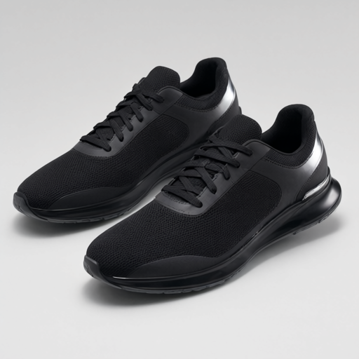 | Commute Running Shoes | /en/docs/blocks |
| 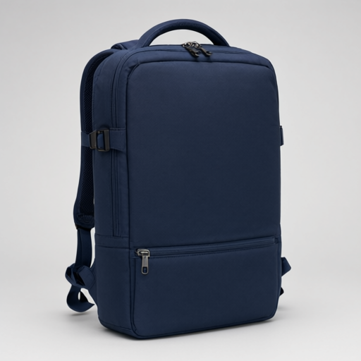 | 2-Way Gym Backpack | /en/docs/blocks |
When a link target (column 3) is present, the whole card (image and title included) becomes a link; otherwise the card renders as decorative, non-linked content. The third column works with either Markdown link syntax or a plain path string.
Show preview
columns
Displays arbitrary content as side-by-side columns. One row = one column group; the number of cells in a row becomes the number of columns.
| columns | |
| --- | --- |
| Text for the **left column**. | Text for the **right column**. |
Cell contents are rendered as-is (HTML), so inline formatting like bold text, line breaks, and links all work. Add another row to stack another column group below.
Show preview
table
The one Block that does not apply positional interpretation. It renders rows straight into an HTML <table>. Use it when you just want a plain data table (a size chart, for example).
| table | | |
| --- | --- | --- |
| Size | Width | Height |
| S | 20cm | 10cm |
| M | 25cm | 12cm |
Show preview
accordion
Good for FAQs and similar collapsible content. Built on the native <details>/<summary> elements, so it opens and closes without any extra JavaScript. 2-column key-value format (column 1 = heading, column 2 = body).
| accordion | |
| --- | --- |
| How long does shipping take? | Usually 3-5 business days. |
| Can I return an item? | Unused items can be returned within 30 days. |
Toggling an item pushes an accordion_toggle event (with blockName/label/state) to the Adobe Client Data Layer (ACDL).
Show preview
tabs
Switches between multiple content panels via tabs. 2-column key-value format (column 1 = tab label, column 2 = panel content), one row per tab.
| tabs | |
| --- | --- |
| Size | Available in S/M/L. |
| Material | 100% polyester outer fabric. |
Built with role="tablist"/role="tab"/role="tabpanel" for accessibility, and supports arrow-key (Left/Right) navigation between tabs.
Show preview
modal
A popup dialog. Built on the native <dialog> element, so focus trapping and closing with Escape are handled by the browser rather than custom code. 2-column key-value format. Supported keys: trigger (the text on the button that opens it), content (the modal body; inline content only).
| modal | |
| --- | --- |
| trigger | View size chart |
| content | Available in S/M/L. |
Clicking the backdrop (::backdrop) also closes it.
Show preview
carousel
A carousel that cycles through images/content. 2 columns, positional: column 1 = image (optional), column 2 = free-form content. Like columns, the content column renders cell HTML as-is, so bold text, line breaks (<br>), links, and other inline markup are all fine.
| carousel (autoplay:3) | |
| --- | --- |
|  | **Commute Running Shoes**<br>[Learn more](/en/docs/blocks) |
|  | 2-Way Gym Backpack |
Supports previous/next buttons and Left/Right arrow-key navigation. Autoplay is off by default; add the autoplay variant (5-second interval) or autoplay:<seconds> (e.g. autoplay:3 for a 3-second interval) to turn it on. When prefers-reduced-motion is set, autoplay is disabled regardless of the variant.
Single vs. multiple mode is detected automatically from the row count, no variant needed. With a single row, the previous/next buttons, dots, and autoplay are all hidden. Wrapping around from the last slide to the first (or vice versa) always animates in the same direction as any other transition.
Show preview
quote
Used for pull quotes, testimonials, and review excerpts. A single row, 2-column key-value format (column 1 = quote text, column 2 = attribution, optional).
| quote (large) | |
| --- | --- |
| This site made checkout so much easier to navigate. | J. Smith (QA team) |
Adding the large variant increases the quote's font size.
Show preview
embed
Embeds external content such as YouTube/Vimeo via an iframe. The minimal form is a single-column, single-row table with just a URL.
| embed |
| --- |
| https://www.youtube.com/watch?v=dQw4w9WgXcQ |
Unsupported URLs render as a plain link instead of an embed (this never fails the build).
Show preview
video
Plays video. Works with both self-hosted video files and external URLs (YouTube/Vimeo, using the same detection logic as the embed Block). 2-column key-value format. Supported keys: src (required; a file path or external URL), poster (optional thumbnail image).
| video | |
| --- | --- |
| src | /videos/demo.mp4 |
You can add variants like video (autoplay, loop) (autoplay automatically adds muted too, to satisfy browser autoplay policies). If src matches the same YouTube/Vimeo pattern used by embed, an iframe embed is rendered instead of a <video> tag.
Show preview
header
The site header navigation. It's never called directly from page Markdown; it's loaded from a dedicated navigation content file and rendered automatically by the shared layout. 2 columns, positional: column 1 = link label, column 2 = link target.
| header | | |
| --- | --- | --- |
| Home | /en/ | |
| Contact | /en/docs/blocks | |
Show preview
footer
The site footer, loaded the same way as header from a dedicated content file. 2 columns, positional: column 1 = link label, column 2 = link target.
| footer | | |
| --- | --- | --- |
| Home | /en/ | |
The copyright line (© <year> AstroTable) is generated automatically.
Show preview
metadata and section-metadata (non-rendering Blocks)
These two Blocks render nothing visible. They exist purely to attach metadata to a page or a section.
metadata adds arbitrary <meta> tags beyond the fixed frontmatter fields (title/description/ogImage). It can go anywhere in the page, though placing it at the end avoids confusion with visible Blocks.
| metadata | |
| --- | --- |
| og:type | article |
| twitter:card | summary_large_image |
Keys starting with og: or twitter: are output using the property attribute; everything else uses name.
section-metadata attaches a styling class to a single section. Unlike metadata, its effect is scoped to the section it's placed in.
## Highlighted section

| section-metadata | |
| --- | --- |
| style | highlight |

This section gets a background color.
The value of style is appended as-is as a CSS class name on that section's wrapping <section> element (comma-separate multiple values). The class's actual appearance still needs to be defined in your site CSS — see the page on extending Blocks for a worked example.